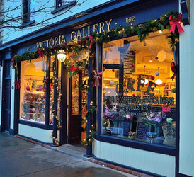
I remember well the time when I worked with my family in our business. We had two shops at one point and the build up to Christmas included the task of building the festive window displays. These had to showcase a wide range of products to appeal to as many window shoppers as possible. Making sure the product was displayed to its best potential and clearly priced was crucial too. There was the temptation to cram as much in as possible but I soon learnt that the old saying ‘Less is more’ was a good mantra to work to, as an overcrowded window means products are often not shown to their best and products can be lost to the eye.
Getting the display right

Your website is also your shop window, so make sure that you are putting on your best display possible.
Well thought out, high quality imagery is essential. We are often surprised at the bad imagery some websites have and the owners seem oblivious to it. We recommend you find someone to give you an unbiased assessment of your imagery. Common errors are out of focus pictures, random items in the background not relevant to the product that can be distracting as well as the wrong colour background.
You can find more insight into this on our blog
https://www.howlingmoonpr.co.uk/get-the-right-picture-for-pr/
Keeping your customers engaged
Thinking of a shop window again or even a restaurant menu, if it never changes even the most loyal customers can become disengaged and look for new ideas elsewhere.
Update your website regularly
The main aim of your website is to attract new customers, but you will also want to make sure that your repeat customers do not get bored of the content and visuals that you have. By updating and changing both your images and text on a regular basis, you can make sure that people see you as a dynamic business, that has plenty to say. Not only this but you may also find that your ranking on Google improves too. Google tends to like websites that are updated regularly and the longer people stay on your page, the more likely it is you’ll rank higher on Google.
Keep the changes coming

It can be difficult to think of new ways to update or change your website. One way to refresh your website home page is using using particular events and seasons such as Valentines Day, Easter, Father’s Day etc. to offer any new products or special offers relevant to the event.
By making some small, cosmetic changes to your website during a particular time of the year, you can change up the way it looks and maybe even draw in some new visitors too.
Sit down and plan for the next 3-6 months – think of suitable promotions and content and then create a series of messages that will reflect this on your home page.
Stand out from the crowd
Whilst it is vital that you appeal to your target market, this does not mean that you have to blend in with all the other companies out there offering the same as you. Embrace what it is that makes you different to the rest, and make sure that your customers can tell the difference too. That way, they are more likely to pick your product
Working with Kate Guy
When Kate Guy engaged us to help with promoting her homeware range, she was interested in using our mentoring service. It soon became clear talking with Kate that she had a great concept in her product range, but this was not clearly being communicated to potential customers. There are dozens of tea towels on the market but what made Kate’s stand out from the crowd was her unique linocut designs and that the illustrated tea towels formed a recipe. We focused on the message ‘Each image is an ingredient’ making sure this was clearly communicated on her website and product range.
Social Media

Don’t forget to tie in your promotions from your website with your social media activity to drive traffic back to your website. Create versions of your Home page content for your for social media to create synergy between all your marketing channels.


